Gateway Arch
With newly renovated grounds, and enhanced visitor experience, we were tasked with relaunching a national iconic brand.
COMPANY: DOVETAIL | ROLE: SENIOR ART DIRECTOR, UI/UX
Overview
Utilizing stakeholder interviews and focus groups, we kept hearing the same thing over and over—the Gateway Arch was a memorable experience that needed to be shared.
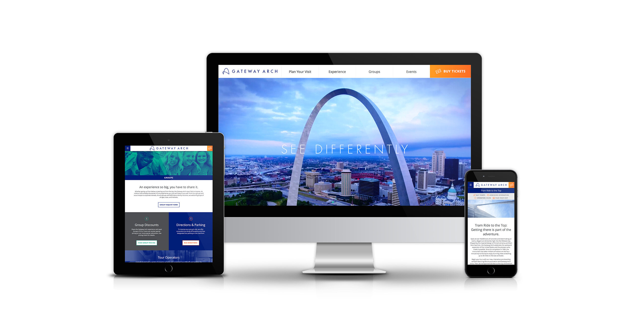
With the rich history of the St. Louis riverfront, and the one-of-a-kind visual experience of the Tram Ride to the Top, the new identity system was developed—See Differently. It was our job to create a unified experience that brought together all of the attractions (The Old Courthouse, new Museum, and Riverboats) and told a compelling story that brought people down to experience it.
We were tasked to develop a new visual identity as well as relaunching a new responsive website with a goal of educating the public of all of the new attractions, as well as a marketing goal of creating a seamless ticket purchasing experience for the Tram Ride to the Top.
With multiple entities working on this project (architects, engineers, public relations, etc.) it was essential for collaboration and compromise to keep a strong and consistent visual identity and user experience. The new identity encompassed a simple and timeless look that reflected Eero Saarinen’s vision of the architectural marvel.
Our goals
-

Brand Hierarchy
Combine all of the attractions at Gateway Arch National Park into the Gateway Arch brand.
-

Build it
Have gatewayarch.com be the preferred online destination for all information regarding Gateway Arch National Park.
-

Sell Tickets
Generate traffic to the website to promote Tram Ride to the Top tickets, as well as cross promote ticket sales for the Riverboats.

Keeping it together
After collecting all of our research, we aimed to simplify the online experience and bring our marketing tool to the forefront.
By combining all attraction information on to one landing page we were able to simplify the user journey into one hub. We utilized anchor links to drive users to key sections of landing pages that were created to convert ticket purchases. Not only did it keep all important information together, but it simplified the user experience and cross promoted other attractions.

Always present
In an effort to make ticket purchasing easy and accessible, we utilized sticky navigation with a “Buy Tickets” CTA to improve visibility to potential ticket sales. With ticket sales being a goal, we wanted to ensure it was always present throughout the user journey.

Keeping it simple
We setup our wireframes on a vertical flowing grid for responsiveness. This allowed all content to flow easily and keep a consistent experience across all platforms.
After evaluating page inventory, we reorganized and condensed the navigation of the website into four main categories: Plan Your Visit, Experience, Groups and Events.
Accessibility
As web design and devices evolve, the need for accessibility for all users is greater than ever. Within the public sector there is even more emphasis on making your information accessible for as many users as possible. During the planning phase, ADA requirements influence not only design decisions, but development decisions as well. We use WCAG 2.0 Compliance as a guide throughout the process to assist individuals who need it.
Closing
After a year of planning and development, gatewayarch.com successfully launched concurrently with the highly anticipated on-site renovations. I believe we were able to take a very complex story, with it’s own set of challenges, and deliver a unified and timeless visual identity to such an iconic monument. As a native of the St. Louis metro area, it was an honor to have such an impact on a highly recognizable architectural wonder.